Why Designers Love Readymag


It’s a website builder that feels like a design canvas—made for bold typography, layouts, and visual storytelling.
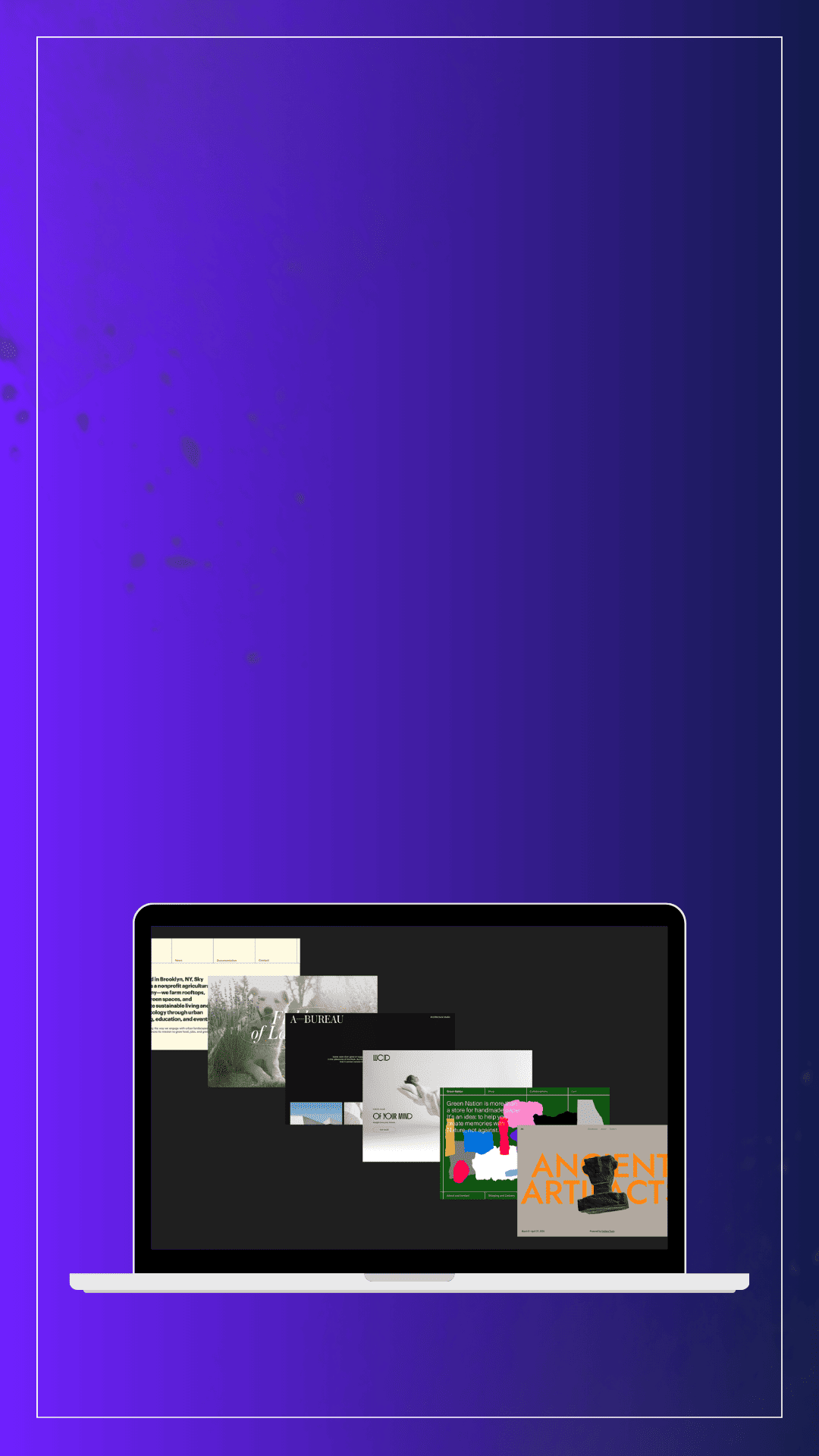
Readymag sites often feel custom because the layout freedom lets designers break out of cookie-cutter patterns.
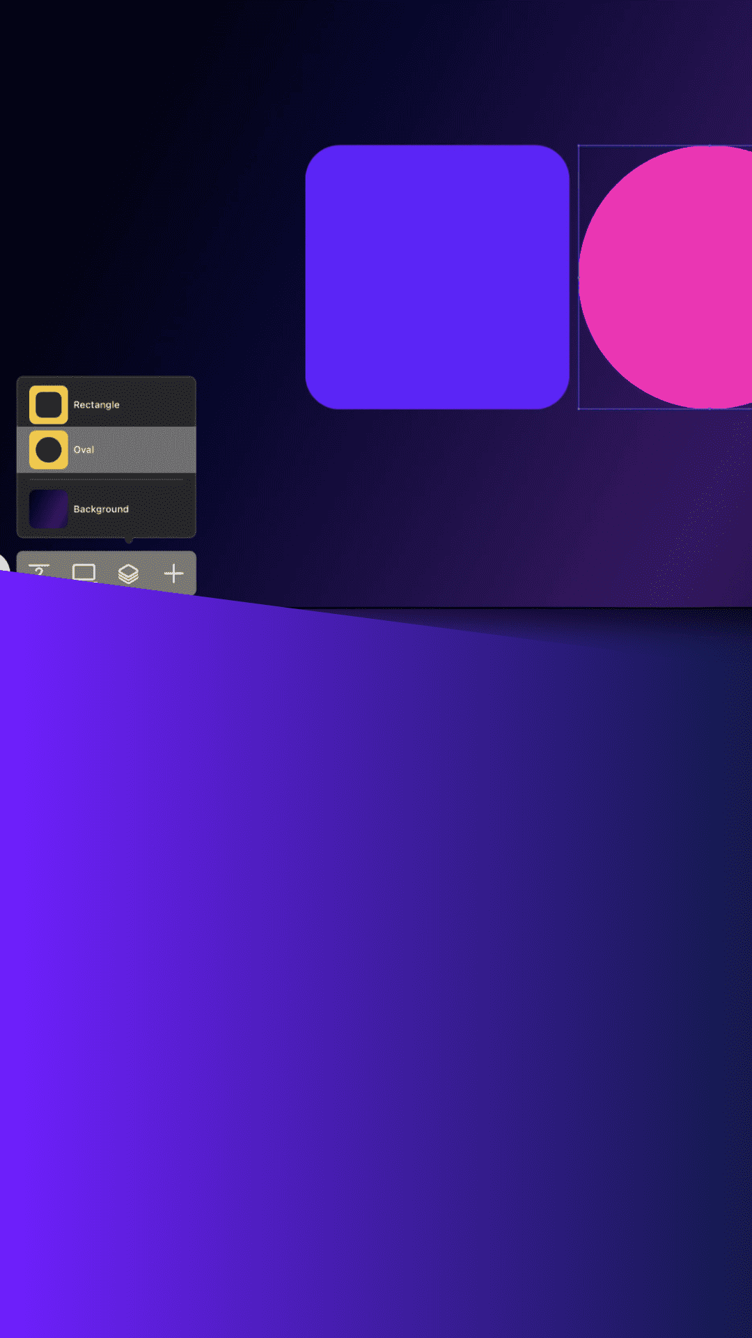
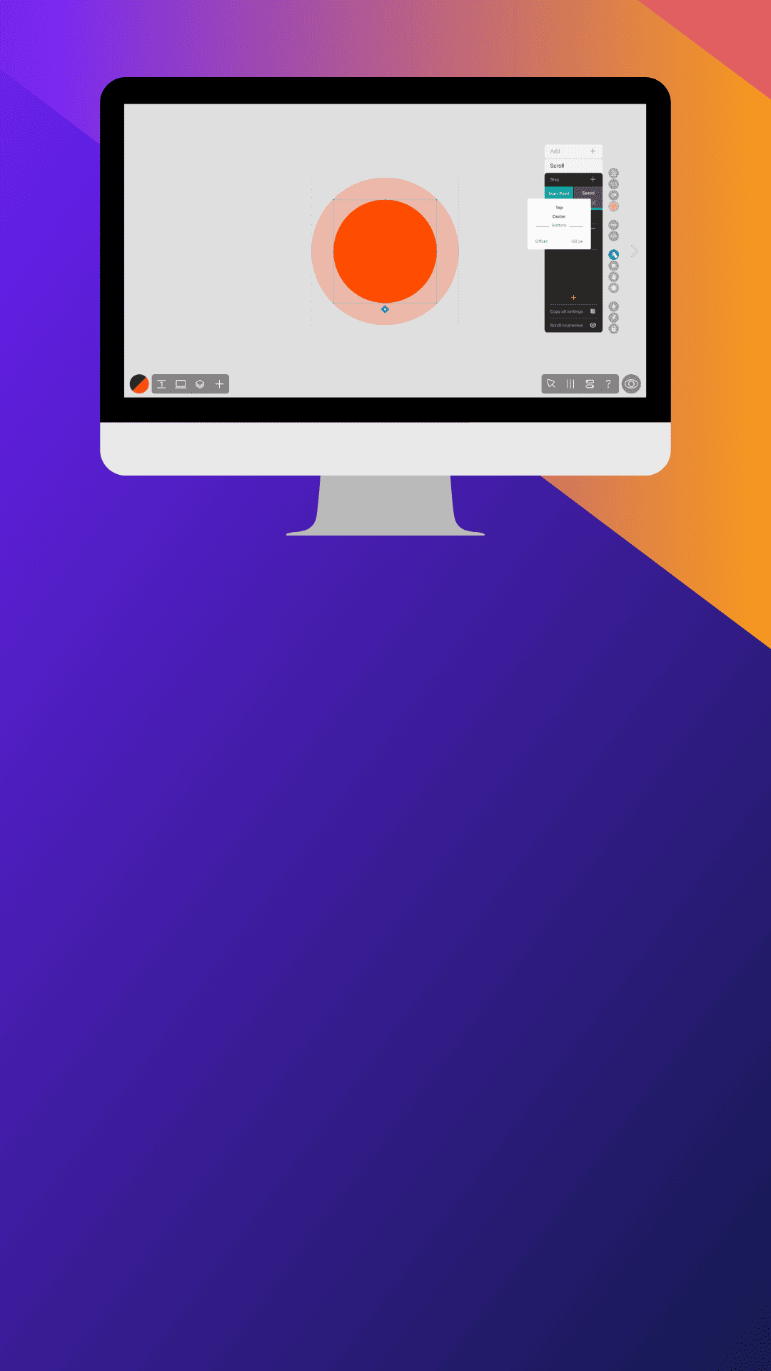
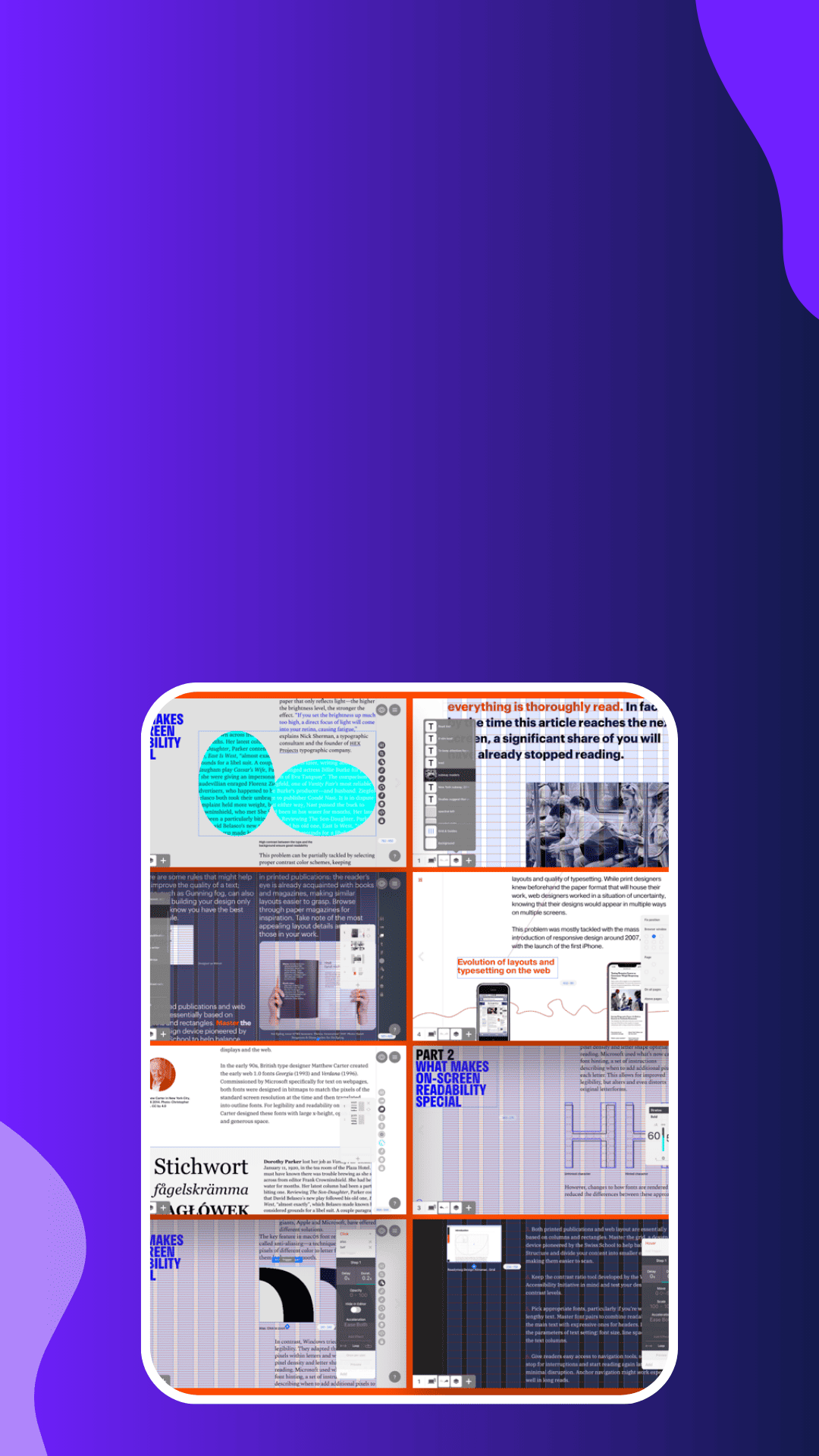
You design directly on the page—move elements, layer content, adjust spacing—without fighting the tool.
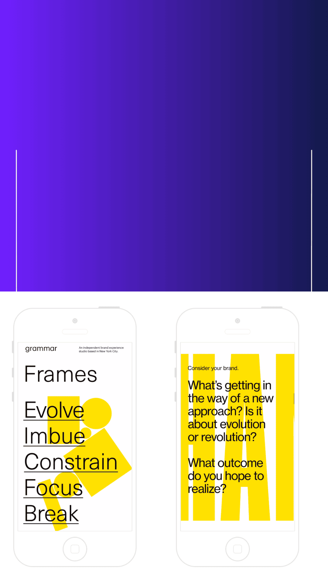
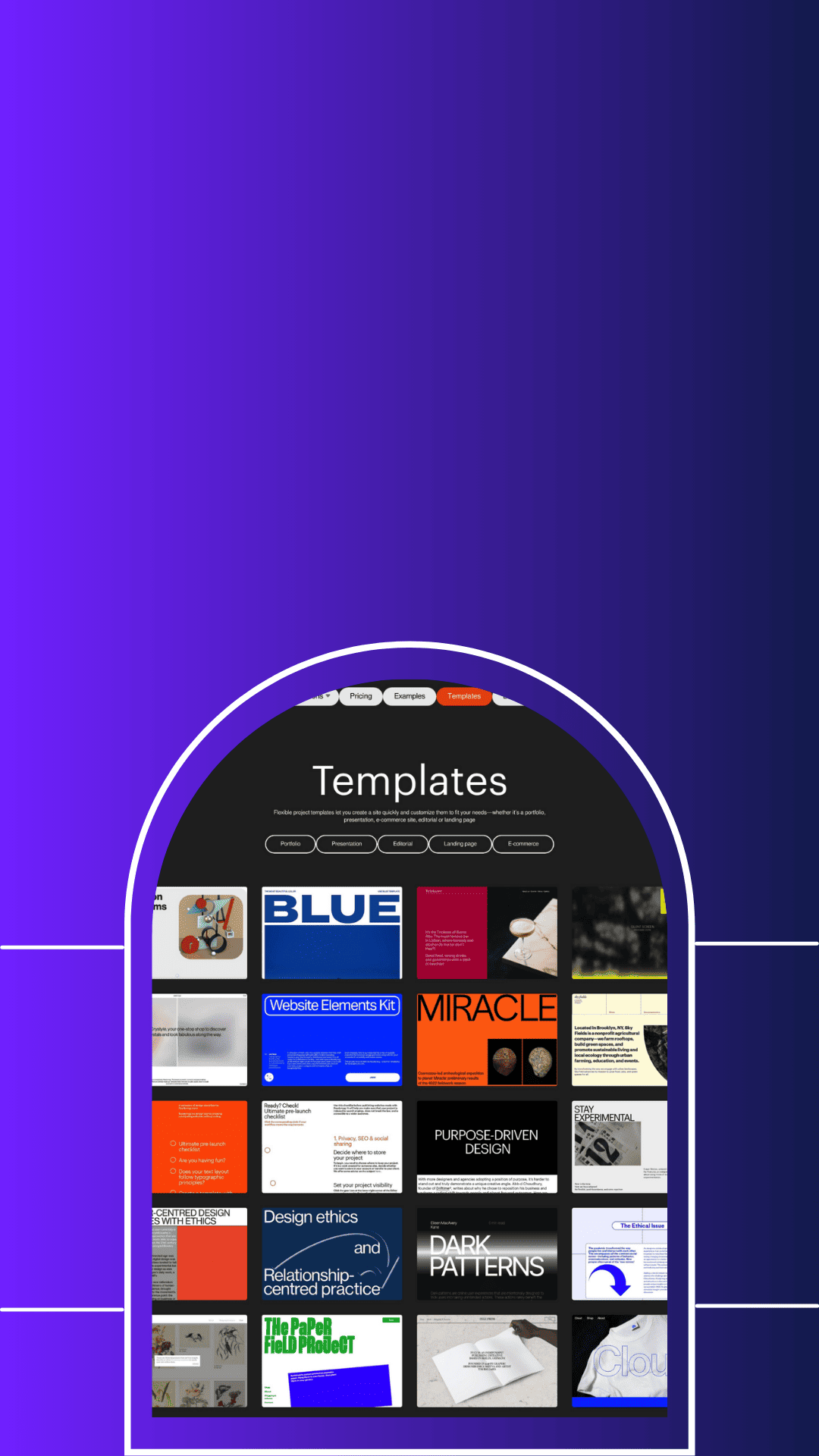
Readymag is loved for type-first design—perfect for portfolios, editorials, landing pages, and brand stories.
Subtle motion, scroll effects, and interactions help designs feel premium—without heavy dev work.
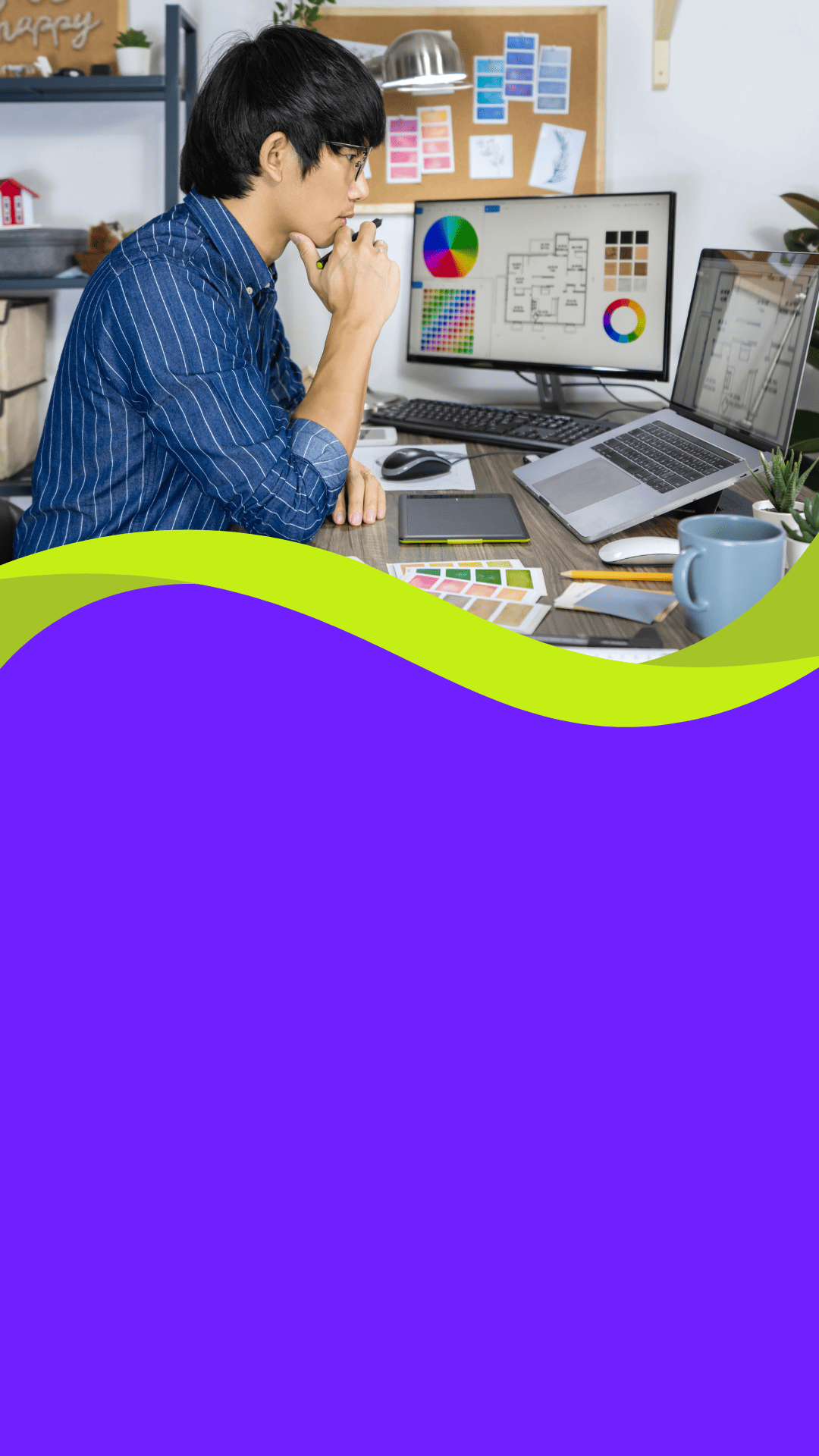
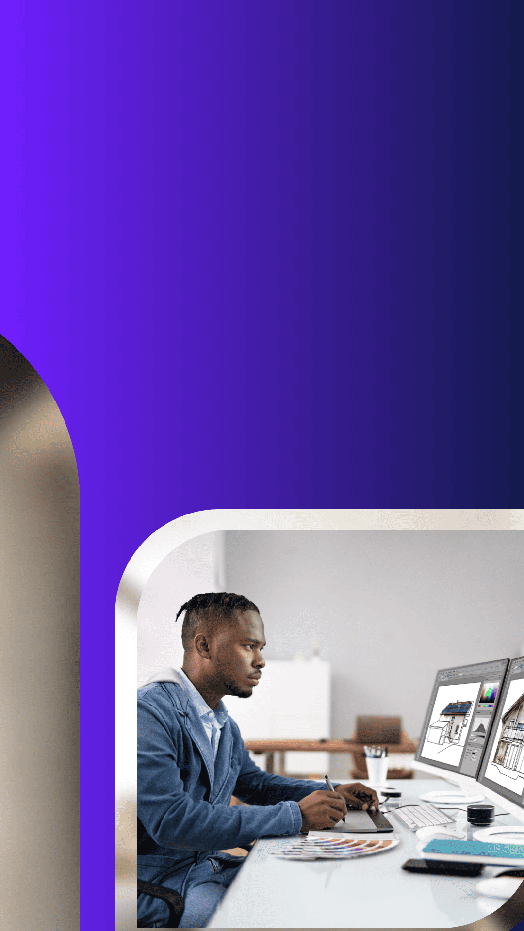
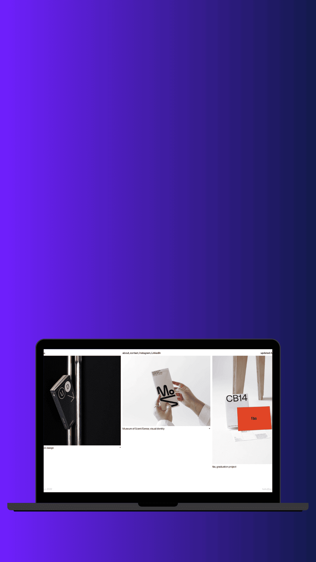
Designers use it to present work beautifully—big visuals, clean grids, and narrative flow that sells the thinking.
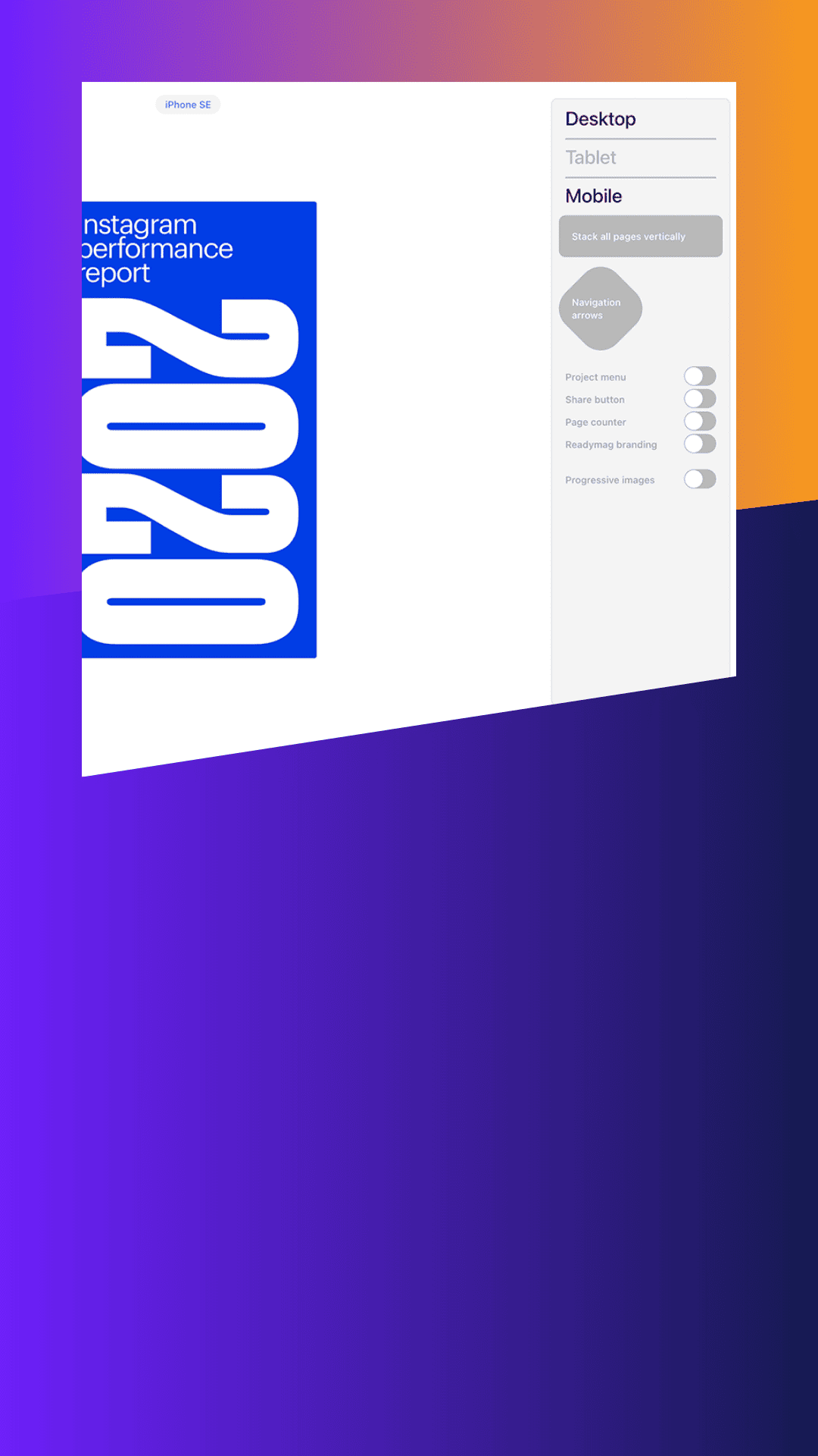
You can tailor experiences across screen sizes, so the design still feels intentional on mobile and desktop.
Update pages quickly, ship ideas faster, and keep polishing—without a dev-heavy workflow slowing you down.
If you like editorial vibes, bold compositions, and playful layouts—Readymag gives you room to explore.
Designers love tools that protect the aesthetic. Readymag gives control, speed, and a clean, modern finish.
Looks like your cart is empty. Why not go ahead and add some products in?
Use the following gestures to browse story content